Dress in the Right Colors and Actually Unwind: What Your Vacation Palette Is Doing to Your Brain
You've booked the flights, reserved the beach chair, and packed your favorite sundress. But have you ever stopped to wonder why certain vacation outfits just feel different — why slipping into a soft sage linen cover-up somehow makes the whole world slow down, while a bold tangerine swimsuit makes you want to jump up and go? That's not a coincidence. Color psychology has been quietly influencing how we feel for decades, and your resort wardrobe is no exception.
At South Bay Resort Wear, we think about clothing as more than just fabric and fit. It's a tool for getting your mind — not just your body — to the beach. So let's talk about what the colors in your suitcase are actually doing.
Why Color Affects Mood at All
The connection between color and emotion is rooted in both biology and culture. Our eyes process color through photoreceptors that send signals directly to the brain, triggering responses in the limbic system — the part responsible for mood and emotion. Certain wavelengths of light are genuinely calming; others stimulate alertness or even mild anxiety.
Research published by color theorists like Faber Birren and more recently by environmental psychologists suggests that cool-spectrum colors (blues, greens, soft purples) tend to lower heart rate and reduce cortisol levels, while warm-spectrum colors (reds, oranges, bright yellows) stimulate the nervous system and boost energy. Neither is inherently "better" — it all depends on what kind of vacation energy you're chasing.
The Vacation Case for Blues and Greens
There's a reason nearly every resort aesthetic leans heavily on turquoise, seafoam, and navy. Blue is consistently ranked as the most universally calming color across cultures, and green is closely associated with nature, restoration, and safety. Together, they mimic the environment you're actually trying to relax in — ocean, sky, palm fronds, and sea glass.
For resort wear, this means a breezy blue-and-white striped cover-up, a sage green linen jumpsuit, or a deep teal swimsuit can subtly signal to your brain that it's safe to exhale. These tones work especially well for destinations like the Florida Keys, Hawaii, or the Caribbean, where the natural surroundings already speak this color language.
Styling tip: If you tend to carry stress into vacation mode, build your resort wardrobe foundation around soft blues and muted greens. Think dusty teal maxi skirts, powder blue linen shorts, or a seafoam one-piece. Layer in neutrals rather than bold contrasts to keep the overall effect serene.
Coral, Mango, and the Energizing Power of Warm Tones
Not every vacation is about stillness. Some trips are about doing — snorkeling, exploring local markets, dancing until midnight, trying every street taco in sight. For those getaways, warm tones are your wardrobe allies.
Coral and warm orange sit at an interesting psychological crossroads: they carry the stimulating energy of red but are tempered with enough yellow to feel joyful rather than aggressive. Studies on color and emotion frequently find that coral and peach tones elevate mood and promote feelings of sociability and warmth. Mango and golden yellow, meanwhile, are associated with optimism and creative energy — exactly what you want when you're wandering a new city or planning a sunset sail.
Destinations like the Mexican Riviera, the Amalfi Coast (for the dreamers), or a lively Miami beach weekend pair beautifully with these warmer palettes. A coral wrap dress, a mango-hued linen blouse, or a warm terracotta bikini can genuinely shift your energy from tired traveler to full vacation mode.
Styling tip: Anchor warm tones with natural neutrals — sand, ivory, warm white — so the look feels beachy rather than overwhelming. A coral sundress with tan leather sandals hits that balance perfectly.
The Quiet Power of Warm Neutrals
Not every color story needs to be vivid. Warm neutrals — think linen white, sand, warm taupe, natural ecru — are having a massive moment in resort fashion, and there's real psychological reasoning behind their staying power.
Neutrals are cognitively "quiet." They don't demand attention from your brain the way saturated colors do. For travelers who are already overstimulated by busy work lives and constant screen exposure, a neutral resort wardrobe can feel like a genuine visual exhale. There's a reason luxury resort properties in places like Turks and Caicos or Scottsdale lean heavily on white linen and sand-tone architecture — it creates a sense of spaciousness and ease.
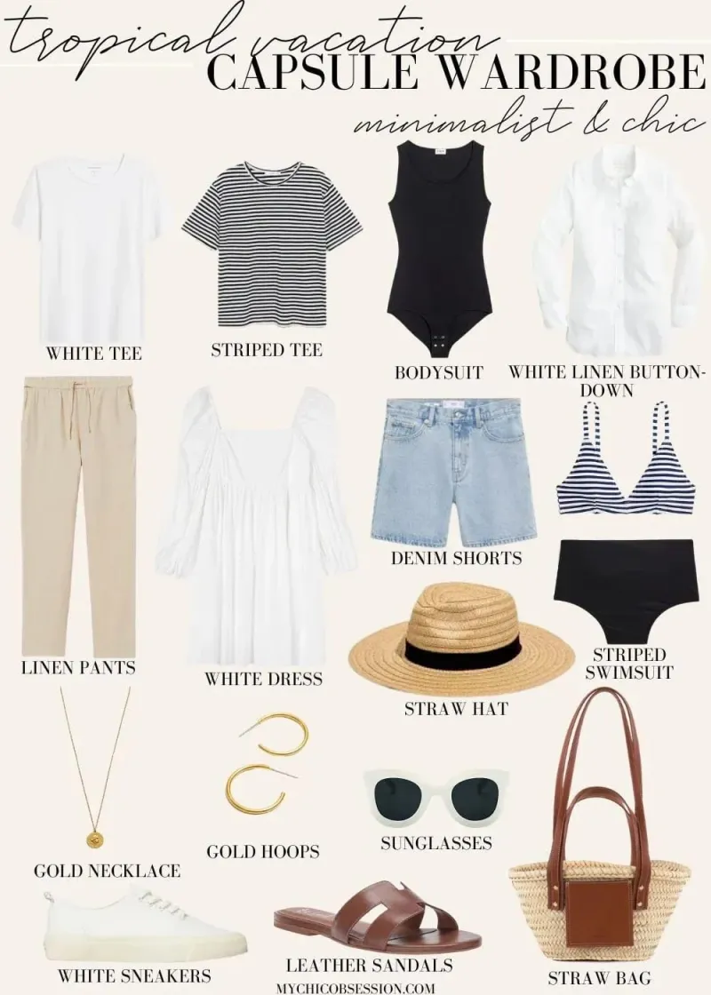
Styling tip: All-neutral doesn't mean boring. Play with texture — gauzy linen, soft cotton terry, woven raffia accessories — to keep the look interesting without adding color noise. A head-to-toe ivory linen set with a natural-fiber tote is effortlessly resort-ready and genuinely calming to both wear and look at.
Building a Vacation Palette Around Your Destination (and Your Personality)
Here's where it gets personal. Color psychology is useful, but it's not a one-size-fits-all prescription. Your ideal vacation palette depends on two things: where you're going and what kind of traveler you are.
Beach-and-chill traveler headed somewhere tropical? Lean into blues, greens, and soft whites. You want your wardrobe to mirror the environment and keep your nervous system in rest mode.
Adventure traveler hitting a lively destination like New Orleans, Puerto Rico, or a Caribbean festival? Embrace warm corals, vivid yellows, and rich tropical prints. Your clothes should match your energy.
Luxury resort guest who wants to feel polished and serene? Neutrals and soft pastels are your power move. Warm white linen, blush, and pale mauve signal calm confidence without trying too hard.
The "I just want to feel good" traveler? Pick the color that genuinely makes you smile when you see it in the mirror. Emotional resonance matters more than any theory. If a bright cobalt blue sundress makes you feel like the best version of yourself, that's your vacation color.
One Final Thought: Color Is a Mood Shortcut
Vacation is, at its core, a mental shift. You're trying to step out of one version of your life and into another — slower, lighter, more present. Your wardrobe can either fight that transition or support it. Choosing colors intentionally is a small but surprisingly effective way to help your brain get the memo that you're actually here, you're actually off the clock, and it's actually time to relax.
At South Bay Resort Wear, we believe getting dressed for vacation should feel like the first act of the trip itself. Choose your palette wisely, and let the hues do some of the heavy lifting.